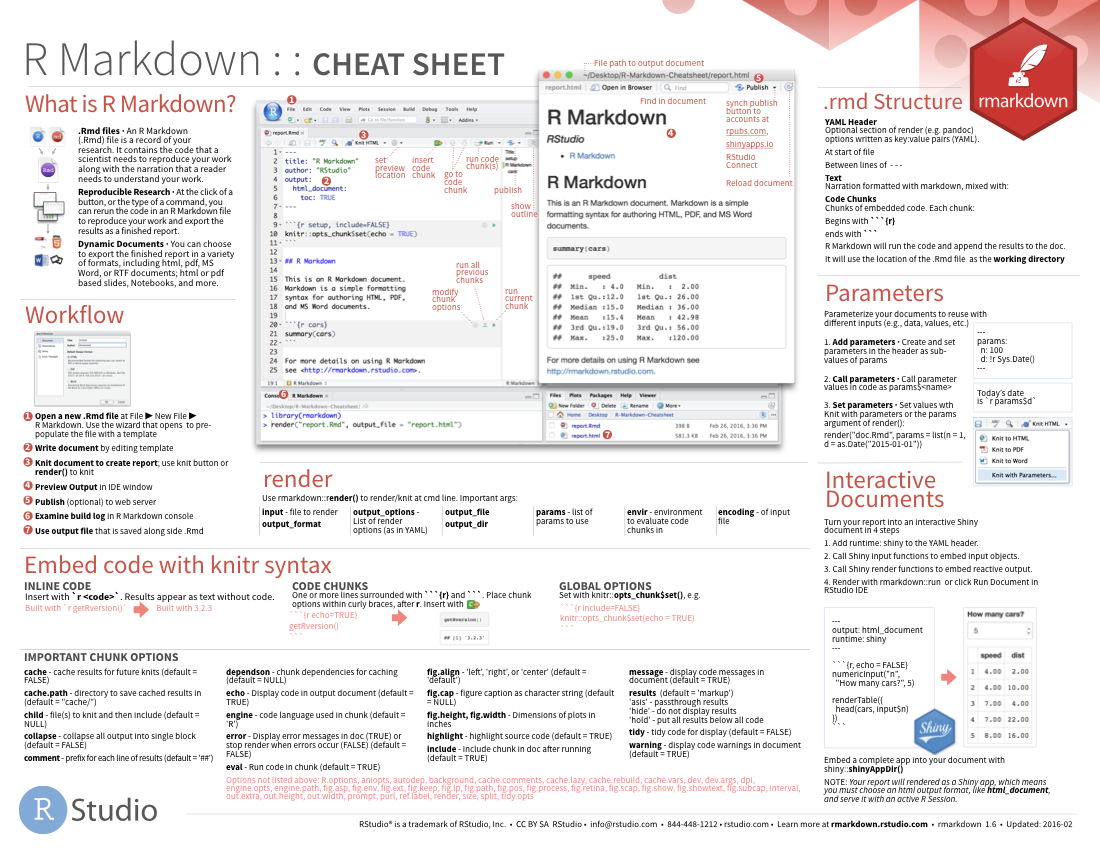
Reporting
|
Introduction to R Bern R Bootcamp |

|

adapted from dertreasurer.de
Overview
By the end of this practical you will know how to:
- Create a new R Markdown file (
.Rmd) - “Knit” an R Markdown file to an
.htmlor.pdfreport - Format text using formatting tags
- Create code chunks
- Add plots and tables
- Include code output in sentences with inline chunks
Tasks
A - Setup
Open your
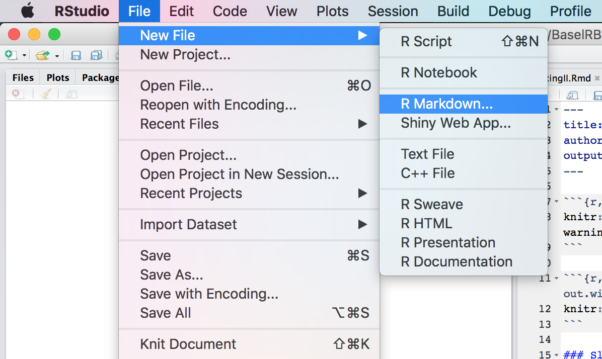
bernrbootcampR project. It should already have the folders1_Dataand2_Code. Make sure that the data files listed in the Datasets section above are in your2_DatafolderBecause R Markdown looks quite a bit different from standard R code, the best way to look at examples is to see a new R Markdown document in action. In RStudio, click File – New File – R Markdown
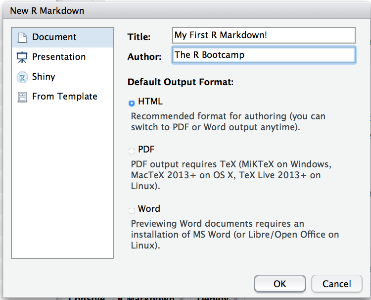
- Give the document a title and an author. For the output format, select HTML (the default). Click Ok!
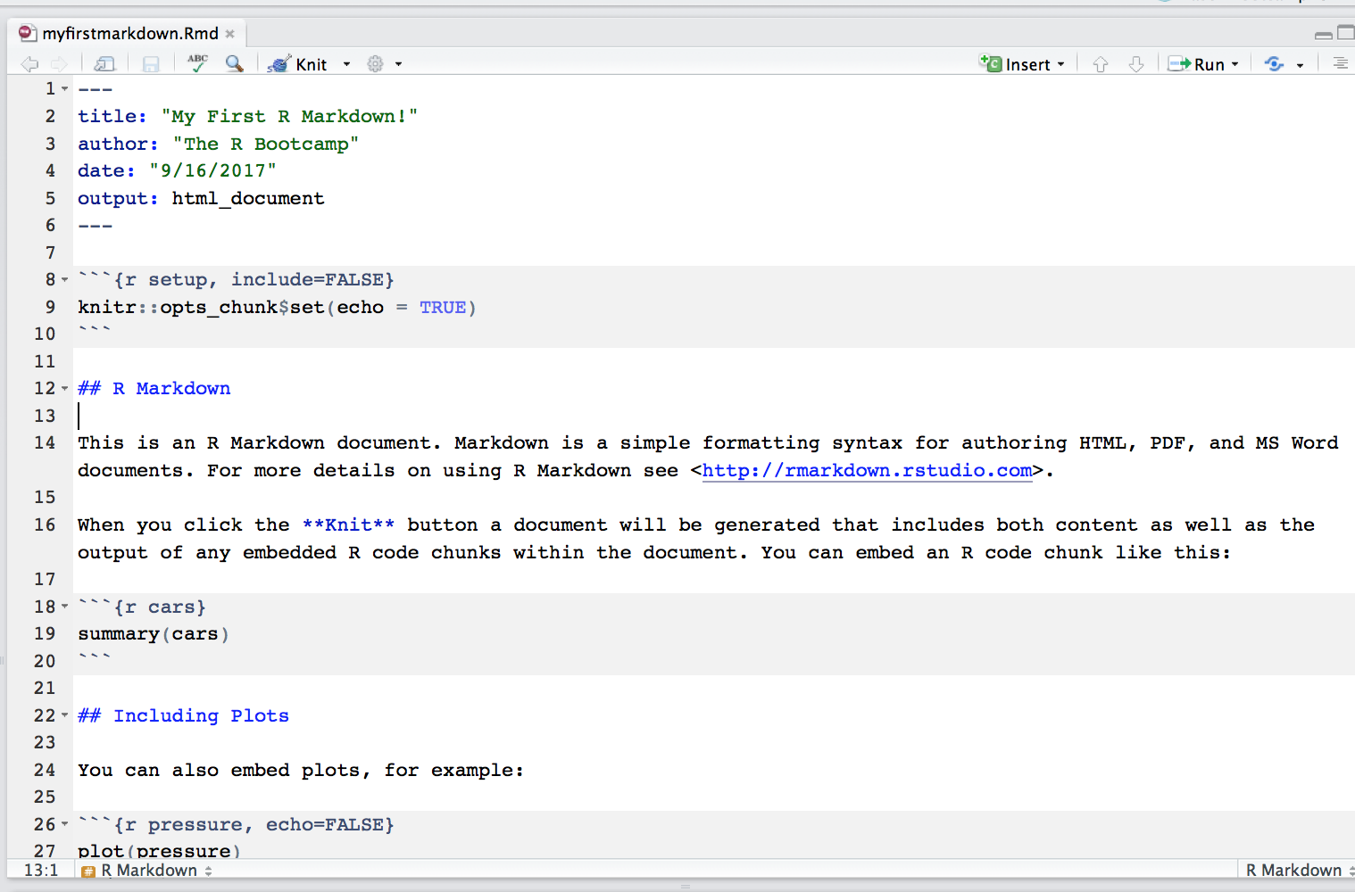
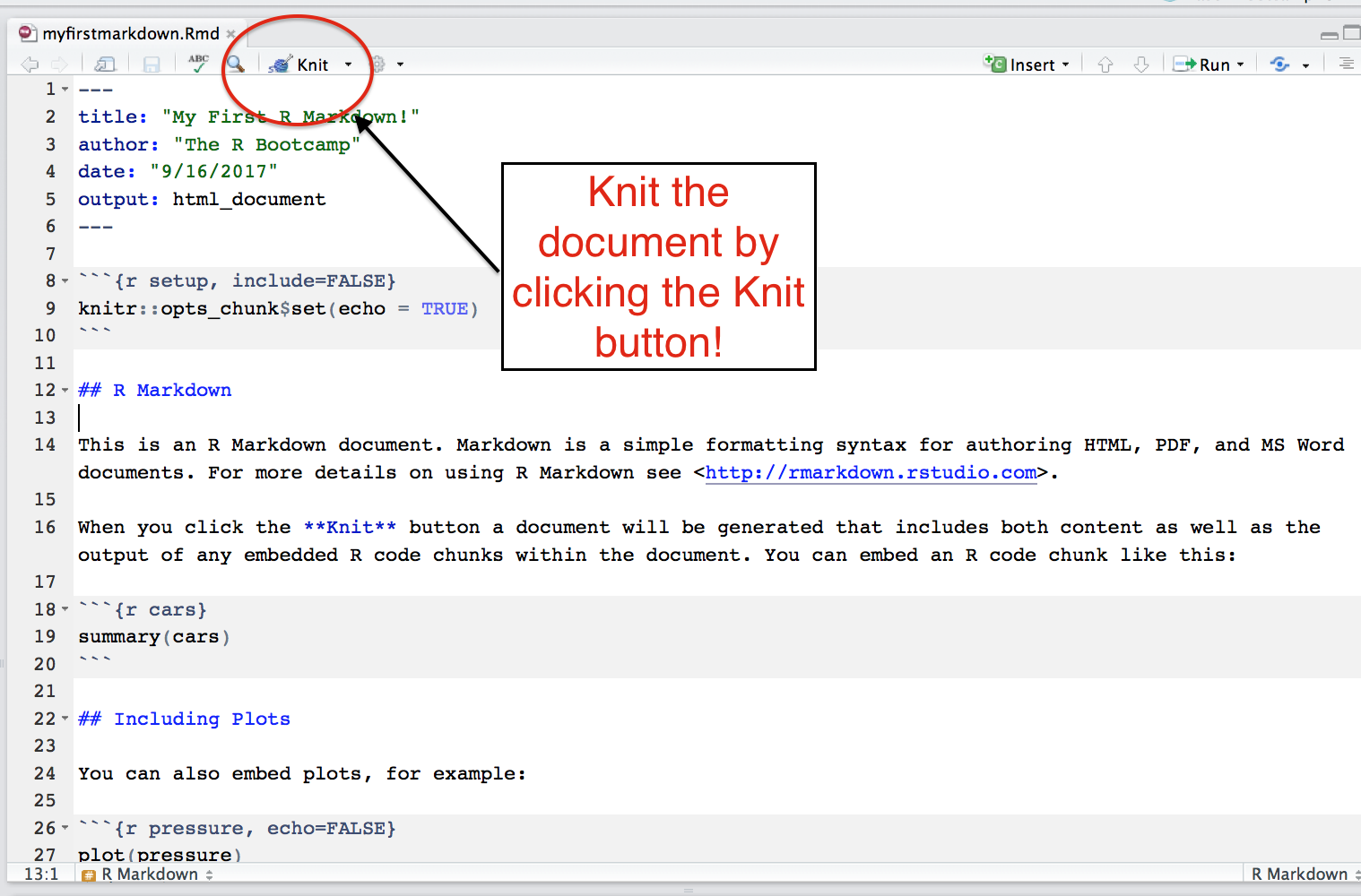
- A new file that looks like this should open up. This is your first R Markdown document!
Save your markdown file in your main project directory (not a sub-folder – you’ll put it there later!) under the name
dynamicreports_practical.RmdNow knit your document to an HTML file. To do this, click the knit button (or use the Command + Shift + K shortcut)
- Now you should see your final, HTML document! Scroll up and down the document and see how she looks!
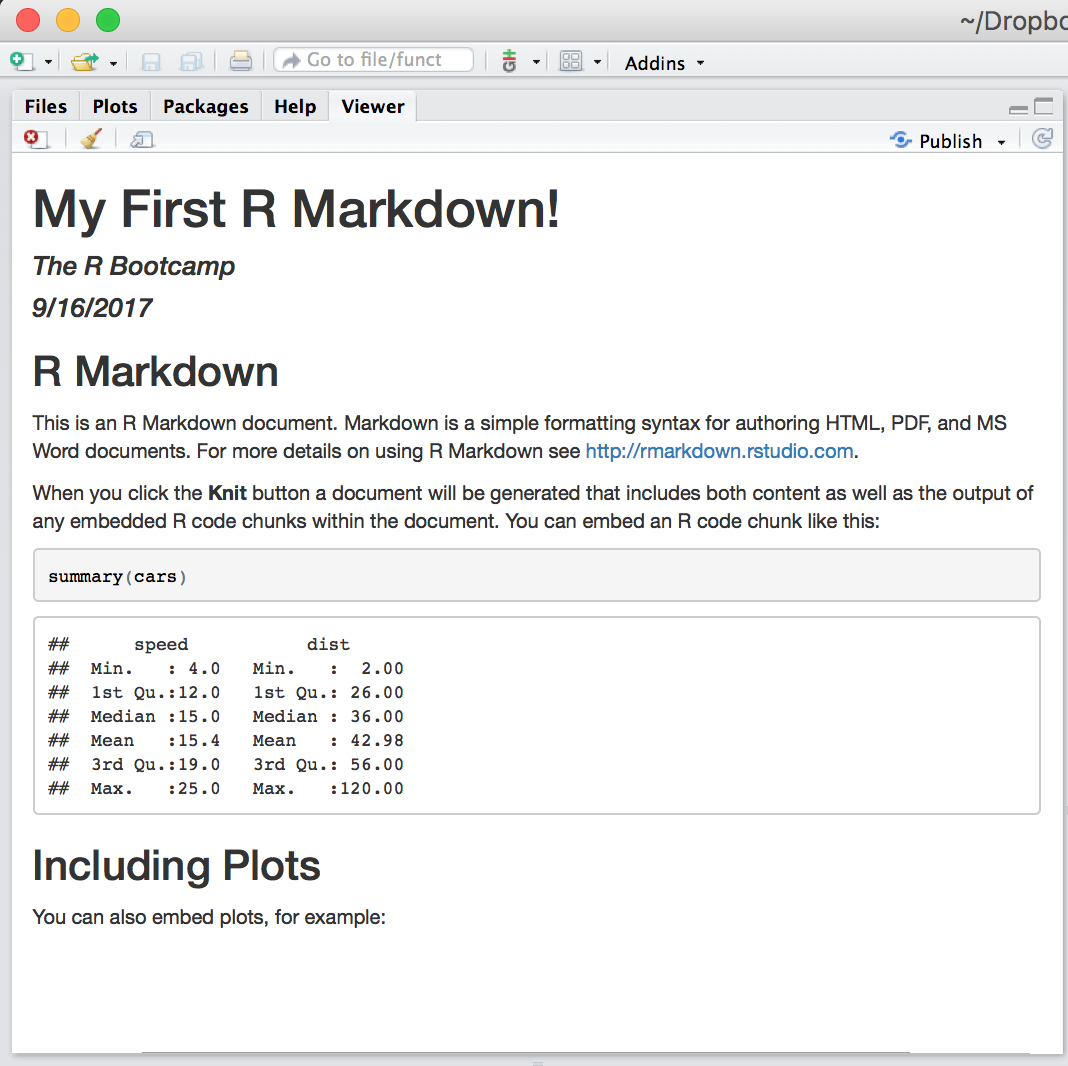
B - Here’s your goal!
In this practical you will create as much of this html document as you can! Open the document and keep it open in a separate window as you work through the practical!
C - Load packages, data and set default chunk options
- The first chunk in your document already has the label
setup. This is your setup chunk. This is a good place to load your packages and import your data. Inside of this chunk, write the comment# Load Packages -------------. Then, using thelibrary()function, load the packages listed in thePackagessection above.
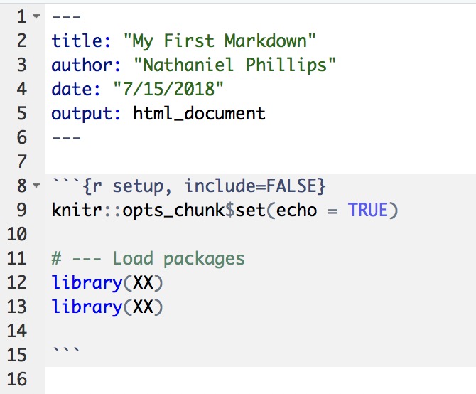
Knit your document! Make sure you don’t get any errors!
Now it’s time to load your datafiles. In the same
setupchunk, load theMcdonaldsdataset.
# --- Load packages
library(XX)
library(XX)

# --- Load data
XXX <- read_csv()
Knit your document! Make sure you don’t get any errors!
Now it’s time to change some of the default chunk options. Inside of your setup code chunk change the existing values of
knitr::opts_chunk$setto the following:
# INCLUDE ALL OF THIS CODE IN YOUR FIRST 'setup' CHUNK!

knitr::opts_chunk$set(fig.width = 6,        # Figure width (in)
                      fig.height = 4,       # Figure height (in)
                      echo = FALSE,          # Repeat code
                      eval = TRUE,          # Evaluate chunks
                      message = FALSE,      # Don't print messages
                      warning = FALSE,      # Don't print warnings
                      fig.align = 'center') # Center figures

options(digits = 2) # Round all output to 2 digits- Knit your document! Make sure you see an output!
D - Add formatted text and an image
- Below your last markdown chunk, write the necessary text and Markdown tags to create the following sentence. Be sure to create italic text using single astricies *italic* and and bold text using two astricies **bold**
- In this practical, I will analyse two datasets and show reproducible results in a dynamic document created in R Markdown. R Markdown is great because I can integrate R code directly into my document, and easily use italics and bold using formatting tags.
Create a new third level header with the text “Overview” using three hashtags
### OverviewKnit the document!
Create a new code chunk by either clicking the “Insert - R” button, or by using the “Command + Option + I”" shortcut on Mac
Now it’s time to add an image to your document! In the chunk you just created, use the following template to include an image of a burger in your document. You can find the image here: link. (Tip: Use right click and copy link address to copy the link)
# Include a buger image

include_graphics(path = "XXX")
Knit the document!
Was your image too big? To make the image a bit smaller, include the chunk argument
out.width = "30%". Note: chunk options are specified within the curly brackets, i.e.,{r, option = value}.Knit the document!
Include the appropriate text and formatting to write the sentence below. When writing the number of columns and rows, use in-line chunks to get the data directly from the
mcdonaldsobject! You can get the number of columns withncol(mcdonalds)and the number of rows withnrow(mcdonalds)
- The
mcdonaldsdata has 24 columns and 260 rows. Each row corresponds to a different menu item. The data originally come from https://www.kaggle.com/mcdonalds/nutrition-facts.
- Knit the document!
E - Add a formatted table with datatable()
Add a new 3rd level header called “Data”
Below the header, write the sentence: “Here is a table showing the first 6 columns in the data”
Create a new code chunk
Inside the chunk, include the following code which uses the
datatablefunction to render a dataframe as a nicely formatted HTML table.
# Print the first 6 columns of the data as a datatable
mcdonalds %>%
  select(1:6) %>%
  datatable()
Knit the document! Do you see your nicely formatted table?
Play around with your table. Instead of selecting the first 6 columns, select the columns
Item,Category,Calories,Sodiumin your code.Knit the document!
F - Add plots
Add a new 3rd level header called “Calories Histogram”
Write the appropriate combination of markdown, text, and code to create the following output. Be sure to specify the mean and maximum umber of calories using inline chunks!. Here’s some
ggplot2code that might help in creating your plot.

# Create a histogram of Calories

ggplot(data = mcdonalds,
       aes(x = XX)) +
  geom_histogram(col = "white") +
  labs(title = "XX",
       subtitle = "XX",
       caption = "XX") +
  theme_bw()
Knit the document! Diagnose and correct any errors!
Add a new 3rd level header called “Calories and Sodium”
Write the appropriate combination of markdown, text, and code to create the following output (Here’s some
ggplot2code that might help!):

# Create a scatterplot showing the relationship
#  between Calories and Sodium

ggplot(data = XX,
       aes(x = XX, y = XX)) +
  geom_point() +
  labs(title = "XX",
       subtitle = "XX",
       caption = "XX") +
  theme_bw()
Knit the document! Diagnose and correct any errors!
Add a 3rd level header called “Calories by Category”
Write the appropriate combination of markdown, text, and code to create the following output (Here’s some
ggplot2anddplyrcode that might help!)
# ggplot

ggplot(data = XX,
       aes(x = XX, y = XX, fill = XX)) +
  stat_summary(geom = "bar", fun.y = "mean") +
  guides(fill = FALSE) +
  labs(title = "McDonalds Menu Items",
       subtitle = "Created with ggplot2",
       caption = "Source: Kaggle.com") +
  theme_bw()

# dplyr

Calories_agg <- XX %>%
  group_by(XX) %>%
  summarise(
    Min = min(XX),
    Mean = mean(XX),
    Median = median(XX),
    Max = max(XX)
  )

kable(x = Calories_agg,
      caption = "Summary Statistics of McDonalds Menu item Calories")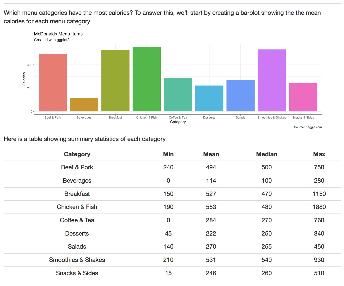
X - Add tabs!
Up to this point, your results are presented in one long html-output - we want to add tabs now, to make reading the report easier. To do this, just add the second level header
## {.tabset}above your### OverviewheaderKnit your document! Do you see the tabs now?
Datasets
| File | Description | Rows | Columns |
|---|---|---|---|
| mcdonalds.csv | Nutrition information from McDonalds menu items | 260 | 24 |
Functions
Packages
| Package | Installation |
|---|---|
tidyverse |
install.packages("tidyverse") |
knitr |
install.packages("knitr") |
DT |
install.packages("DT") |
broom |
install.packages("broom") |
rmdformats |
install.packages("rmdformats") |
Resources
Documentation
The
rmdformatspackage has many nice templates for .Rmd files. Look at their GitHub page at https://github.com/juba/rmdformats for examples. If you install the package from CRAN withinstall.packages('rmdformats'), you’ll get lots of new templates when you open a new Markdown file in RStudio.If you want to use custom .css files, check out the the R Studio HTML document guide. You can also look at the .css files underlying the
rmdformatspackage on their GitHub page here https://github.com/juba/rmdformats. For example, here is their .css file for the “html docco” template https://raw.githubusercontent.com/juba/rmdformats/master/inst/templates/html_docco/docco.css
